TUI
Leading the App Design System
This work focused on creating a scalable and accessible design system for TUI’s App. The goal was to address fragmentation across design and development libraries, support multiple brands, and establish foundations that could scale across platforms and teams.
Impact
I established accessible and scalable foundations for a multi-brand App ecosystem, aligned design and development libraries, and defined clear processes for contribution and governance. This work introduced structured documentation for components and accessibility, improved consistency across platforms and brands, and laid the groundwork for long-term App and Web alignment.
Role
Drove the creation of the App Design System end to end
Year
2025
Context
I initiated and drove the creation of the App Design System end to end. The existing library was fragmented, difficult to scale, and inconsistently implemented across design, iOS, and Android, with duplicated components, accessibility gaps, and no clear ownership.
Alongside hands-on design work, I managed prioritisation, workflows, and communication, mentored two designers contributing weekly, and collaborated closely with App design leadership, the Web design system team, and designers from other brands to align across platforms.
Constraints
The design system needed to support multiple brands and regions, work consistently across iOS and Android, and meet accessibility standards, all while evolving alongside ongoing product development.
A key constraint was ensuring meaningful alignment between App and Web design systems, delivering consistency across platforms without compromising platform-specific patterns and capabilities.
Design and Code libraries
Strategy & approach
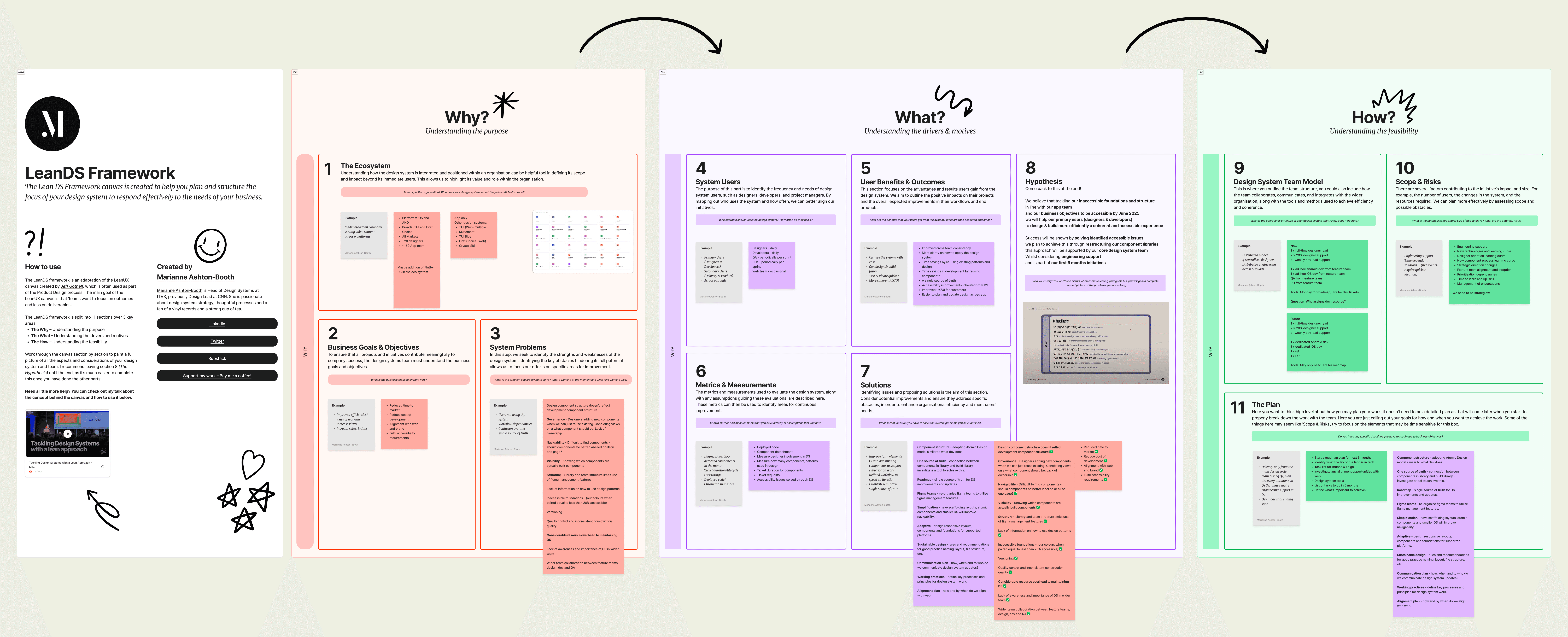
The initiative began with a workshop with App design leadership using the Lean DS Framework. This helped align on purpose, scope, constraints, and success criteria, and establish a phased approach before moving into execution.
From there, I defined processes for communication, contribution, and prioritisation, and worked closely with designers across brands and with the Web design system team. Rather than rushing into components, we focused on fixing foundations first to ensure accessibility and scalability from the start.
Research into established design systems informed naming, structure, and documentation patterns, while decisions were made deliberately based on App-specific needs.
Outcome of the workshop
Foundations first
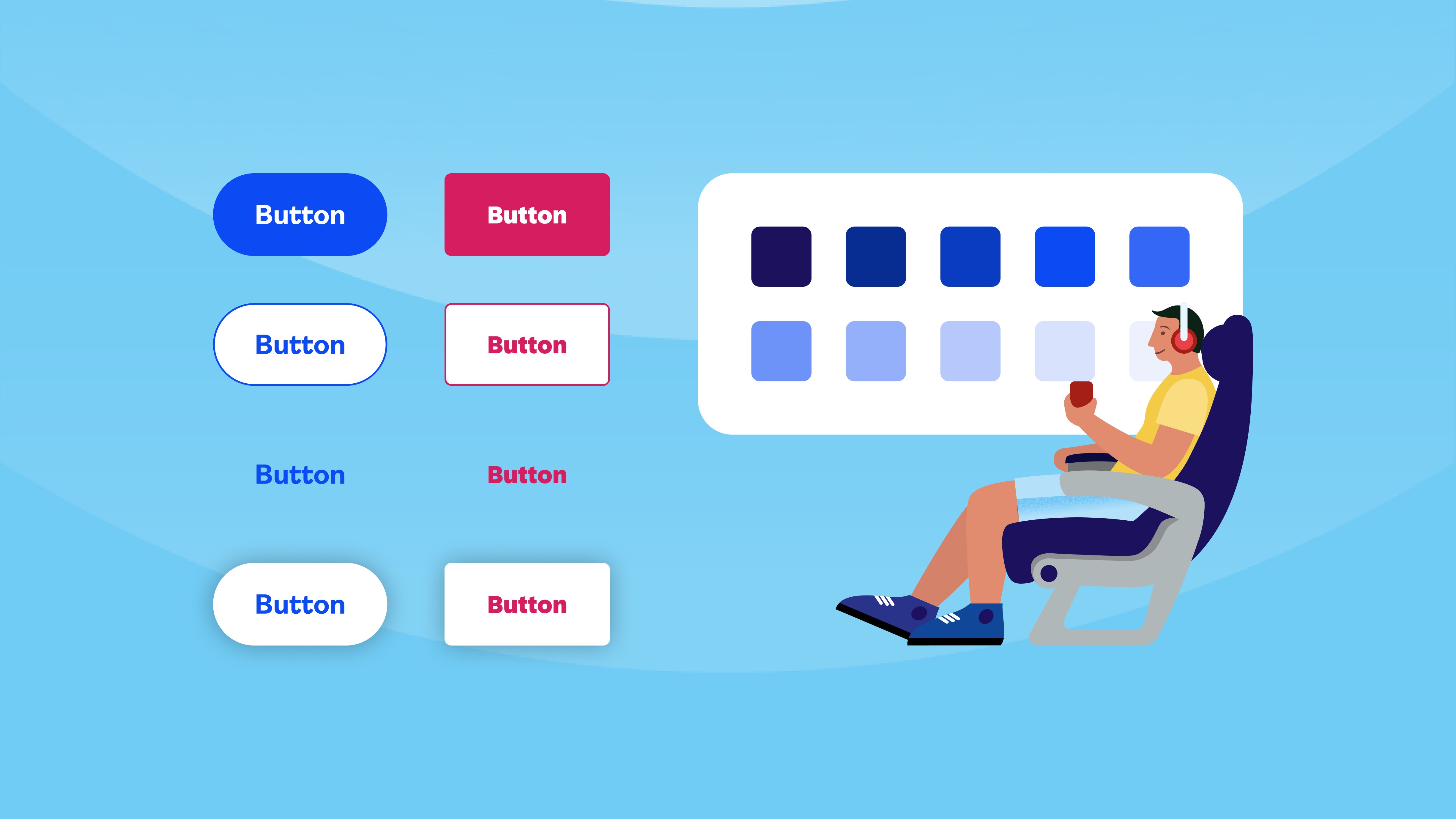
The most critical blockers were the lack of a complete colour palette and accessible typography. Without these, it was impossible to define reliable tokens or build accessible components.
We rebuilt the colour system with semantic tokens aligned to WCAG standards and redesigned typography to be scalable across devices and accessibility settings. From there, we expanded into spacing, corner radius, border, motion tokens, and aligned iconography and illustrations across brands.
This work was done in close collaboration with the Web design system team and designers from other brands, ensuring alignment where possible while respecting platform-specific needs. A responsive grid was also introduced to support consistency across devices and orientations.
TUI brand
First Choice brand
System architecture
The App design system follows the Atomic Design methodology. Components are treated as part of a system rather than isolated solutions, designed to scale across teams, brands, and platforms.
Previously, components were often created to solve narrow, team-specific problems, leading to duplication and inconsistencies. The new approach defines clear criteria for what becomes a component and emphasises flexibility through well-defined variants and properties rather than duplication.
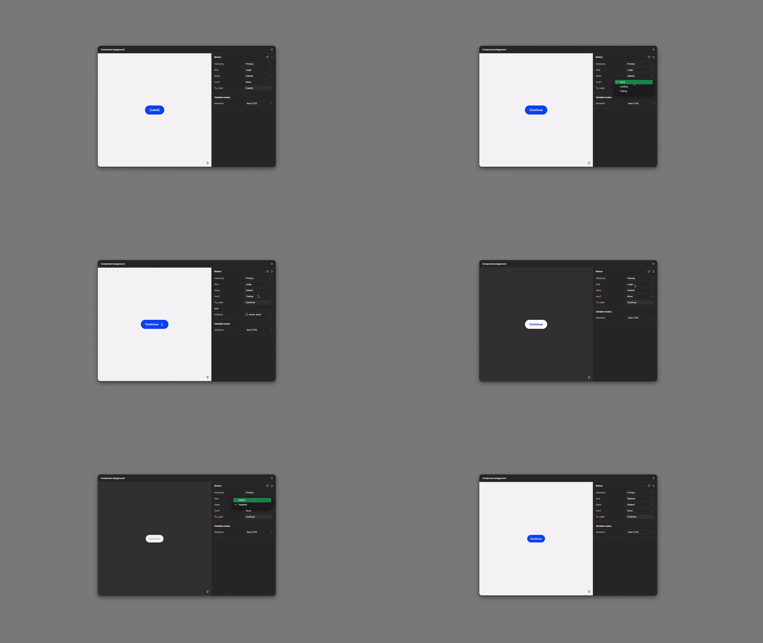
In Figma, components expose the right level of control so designers can adapt them without detaching, while staying within system constraints. This also allows developers to explore component behaviour directly, reducing ambiguity earlier in the process.
Button component playground in Figma
Documentation and governance
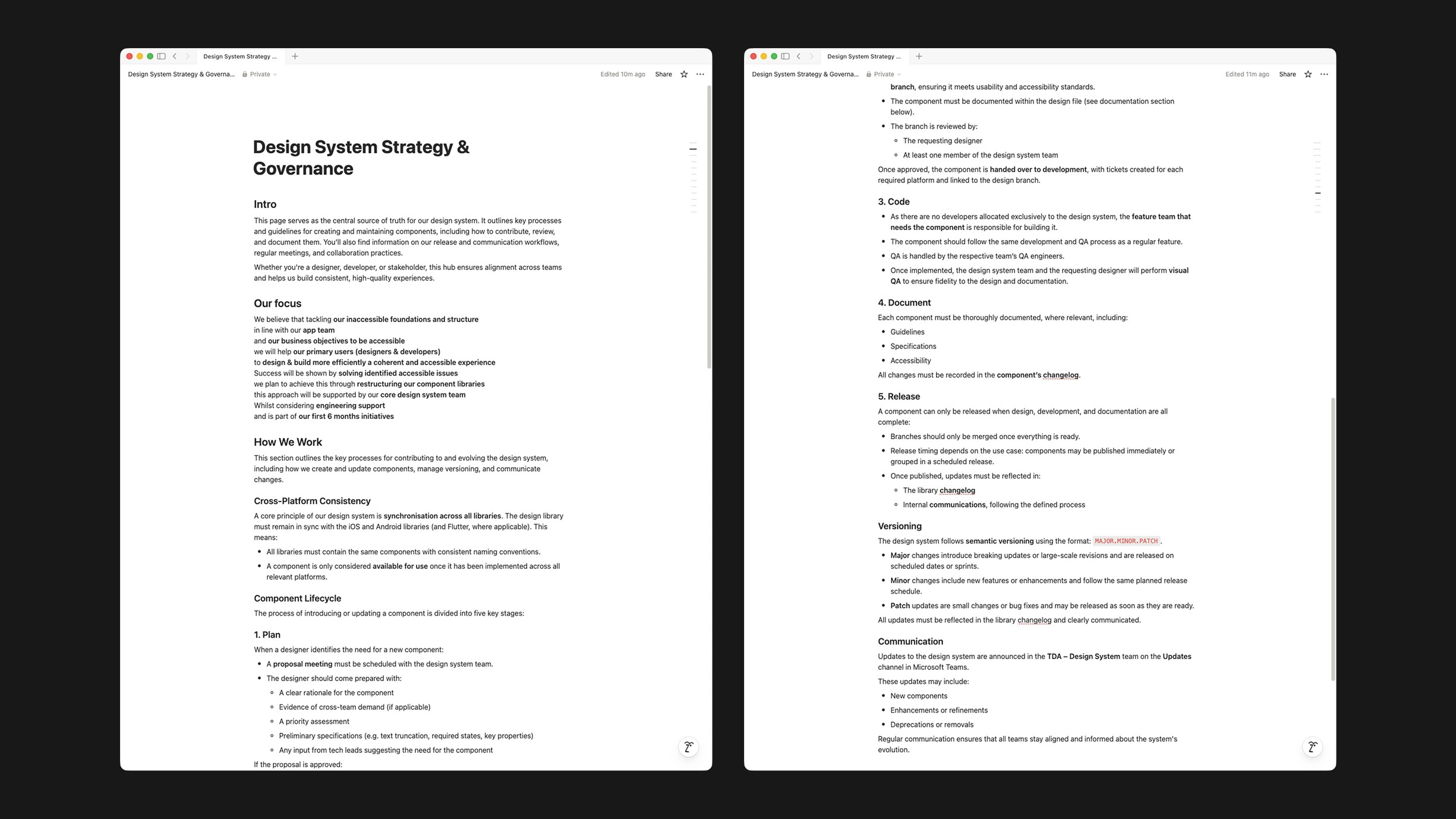
Documentation lives directly in Figma, alongside the components themselves. Each component includes guidelines, developer specifications, and explicit accessibility requirements, with documentation maintained per brand to make differences visible and intentional.
Clear processes for contribution, review, and updates were established to reduce ad-hoc decisions and support shared ownership as the system scales.
Snapshot of the documentation for strategy and governance
Snapshot of the button component documentation
Outcomes
Although still rolling out, the system has already made a measurable impact on how teams design and build. App and Web foundations are now more closely aligned, reducing inconsistencies across platforms and brands.
On Android, 7 core components have already been built in the new system, replacing 25 previously duplicated components and consolidating the library into a smaller, more coherent set. Accessibility is now addressed at foundation and component level, rather than retrofitted later.
Design and development libraries share more consistent naming and structure, improving parity between design intent and implementation and reducing rework. Clear documentation and defined contribution and review processes have introduced governance where none existed before, creating a more predictable and scalable way of evolving the system.
Early feedback from designers, developers, and product stakeholders has been positive, particularly around clarity, usability, and confidence in the system.


